Along with many biologists, ecologists, and general wildlife-lovers, I am an avid user of iNaturalist, and I try to take pictures of organisms I encounter in the field or even around my home city, Boston. (You can see another post I’ve written on the subject here).
knitr::include_graphics("/img/inatgraph1.jpeg")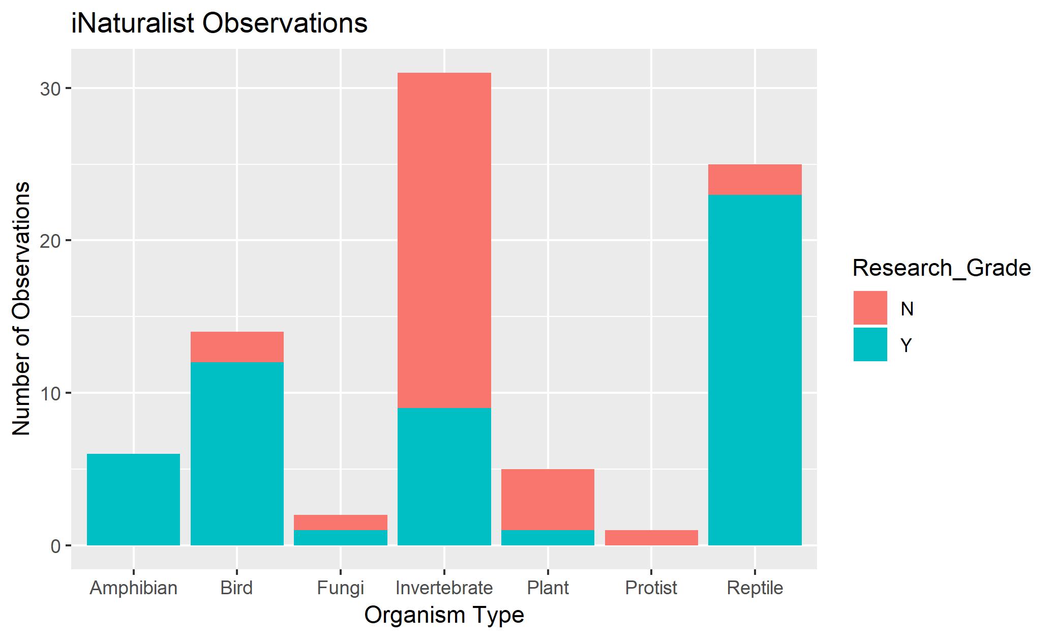
Unfortunately, one limitation, the “invertebrate bias,” is present in the data. A study published by Dr. Mark Titley from Cambridge University Museum of Zoology indicates that invertebrates are not as readily studied by biologists. Looking at my graph, it’s clear that I am guilty of such bias - not only did I group all of my invertebrates together rather than separating them out into smaller taxonomic groups, a great proportion of them are unidentified! (That may also indicate an invertebrate bias within the iNaturalist community, as the only way to get an observation to become research grade is for it to be accepted by at least three other people in the community).
knitr::include_graphics("/img/inatgraph2.jpeg")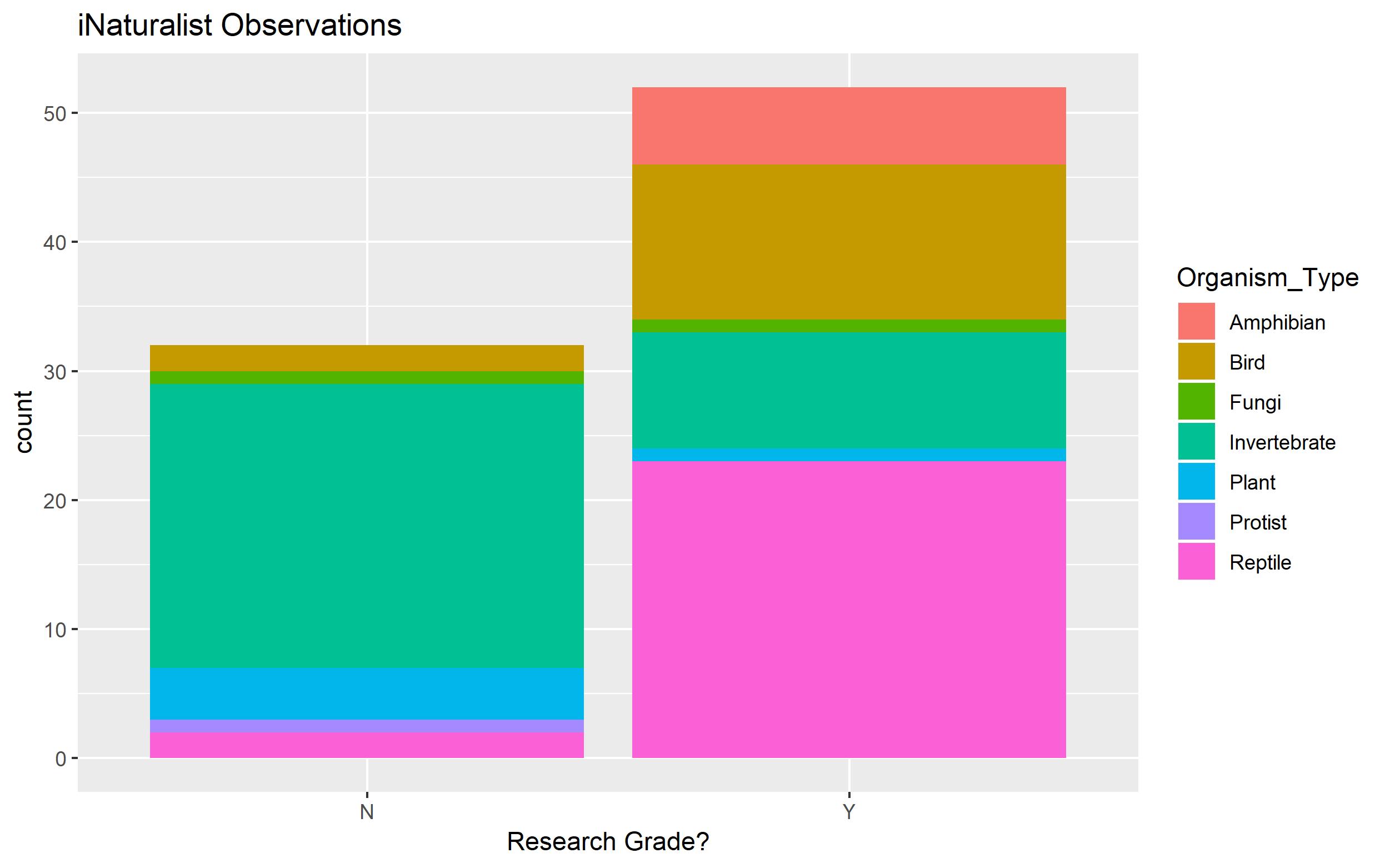
After the “catch-all” group of invertebrates, it’s no surprise that reptiles are my second-most observed group, as I love them so much. Below is another graph of the same data, although this one gives a breakdown within whether the observation is research grade or not.
Lastly, I was just curious to see this - I graphed my iNaturalist observations by place. This one might be my favorite - as it shows the breakdown of all the things I’ve seen so far, everywhere!
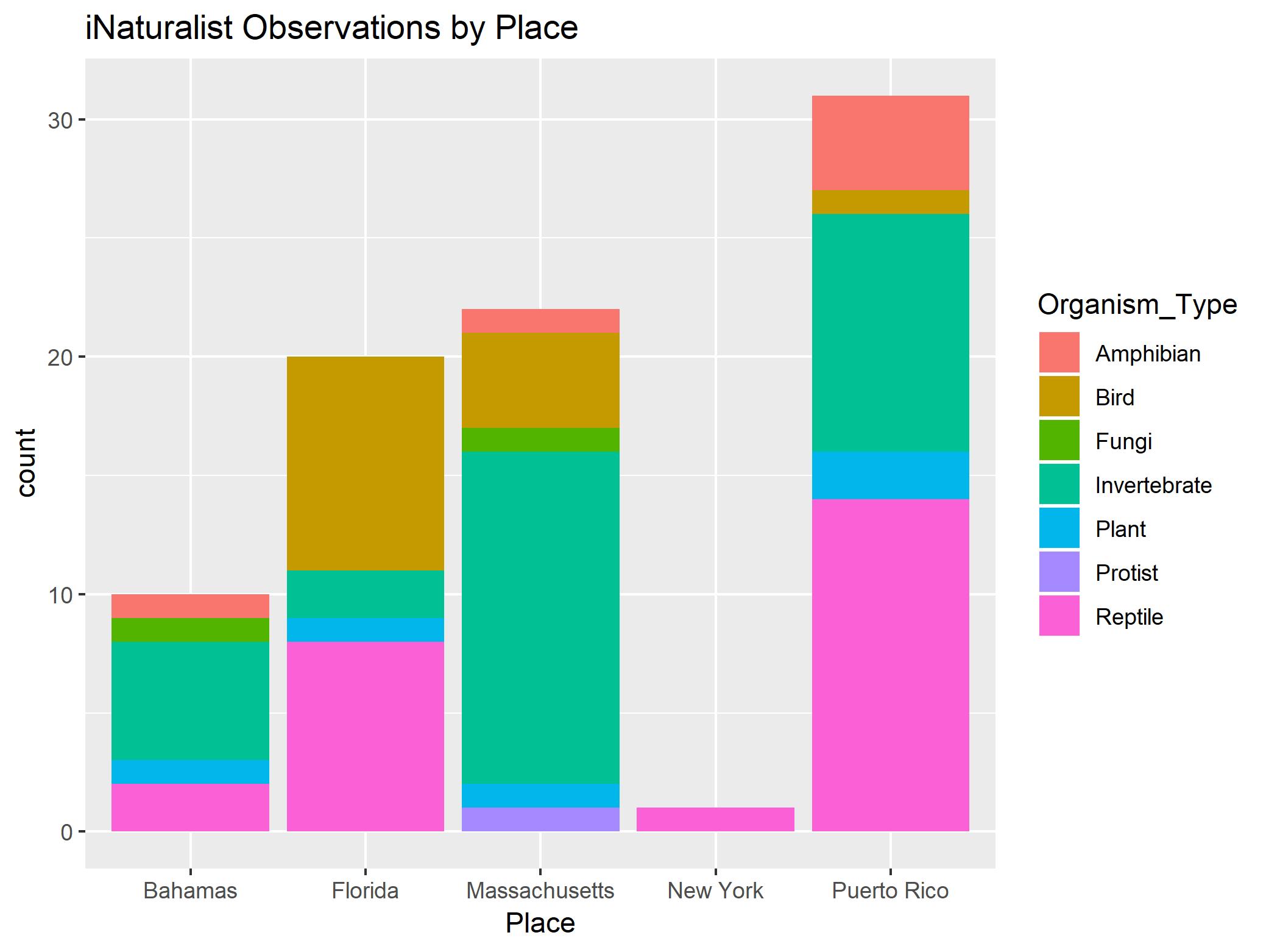
Although the data is biased against invertebrates (and towards my favorite types of organisms like reptiles and amphibians), these graphs do show. I’ll be sure to update them with any future field work localities and observations as they come!
Citation: Titley, M. A., Snaddon, J. L., & Turner, E. C. (2017). Scientific research on animal biodiversity is systematically biased towards vertebrates and temperate regions. Plos One,12(12). doi:10.1371/journal.pone.0189577