I’ve always been a huge reader, so when I discovered Goodreads in 2013 in middle school, I’ve pretty much logged every single book I’ve read since on the website.
I had always wanted to explore my Goodreads data, because it’s a big data set (I’ve put over 500 books on the site), but hadn’t gotten around to it yet as I wasn’t sure how to best structure and collect my data set from my Goodreads account. That being said, after finals (bye-bye sophomore year!), I was tooling around and found a way to export my data directly to a CSV, perfect for playing with it in R!
Here are a few fun graphs about my Goodreads history.
The Graphs
To start playing with the data, I wanted to explore whether my opinions on books aligned with the public’s general opinions. On Goodreads, you can rate the book from 1-5 after you have finished it, with 1 being a low rating and 5 being a high rating. I wanted to compare my ratings to the average value (others’ ratings) of books.
First, I wanted to correlate the two variables. Using R, the correlation coefficient was calculatedd to be .2576, which was lower than I expected. This low value means the two variables are not strongly linked in a linear relationship.
with(gr_tbl, cor(My_Rating, Average_Rating))
## [1] 0.2575739
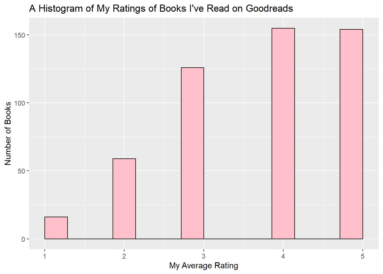
I graphed the ratings of all the books I’ve rated on Goodreads below. This histogram has more of a discrete scale, because readers can only rate books as integer values from 1-5.
mean(gr_tbl$My_Rating)
## [1] 3.729412
ggplot(gr_tbl, aes(My_Rating)) +
  geom_histogram(bins=15, col="black", fill="pink") +
  labs(x="My Average Rating", y="Number of Books", title="A Histogram of My Ratings of Books I've Read on Goodreads")
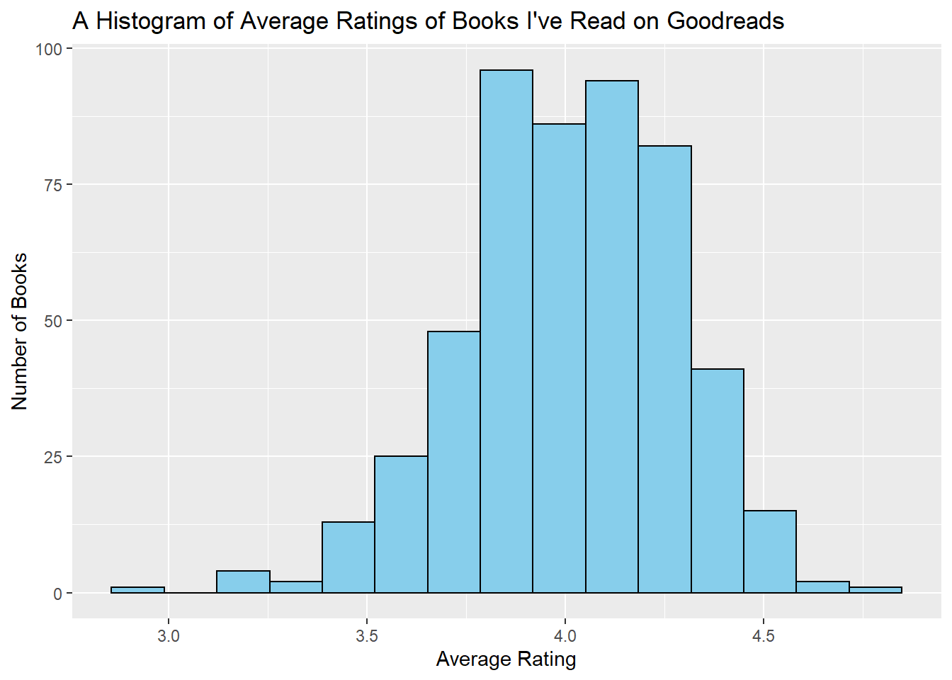
Then I graphed the distribution of the average rating of all the books I’ve read on Goodreads. This histogram has more of a continuous x-scale because it’s the average of all of its readers’ ratings and thus isn’t constrained to being 1-5.
mean(gr_tbl$Average_Rating)
## [1] 4.009784
ggplot(gr_tbl, aes(Average_Rating)) +
  geom_histogram(bins=15, col="black", fill="skyblue") +
  labs(x="Average Rating", y="Number of Books", title="A Histogram of Average Ratings of Books I've Read on Goodreads")
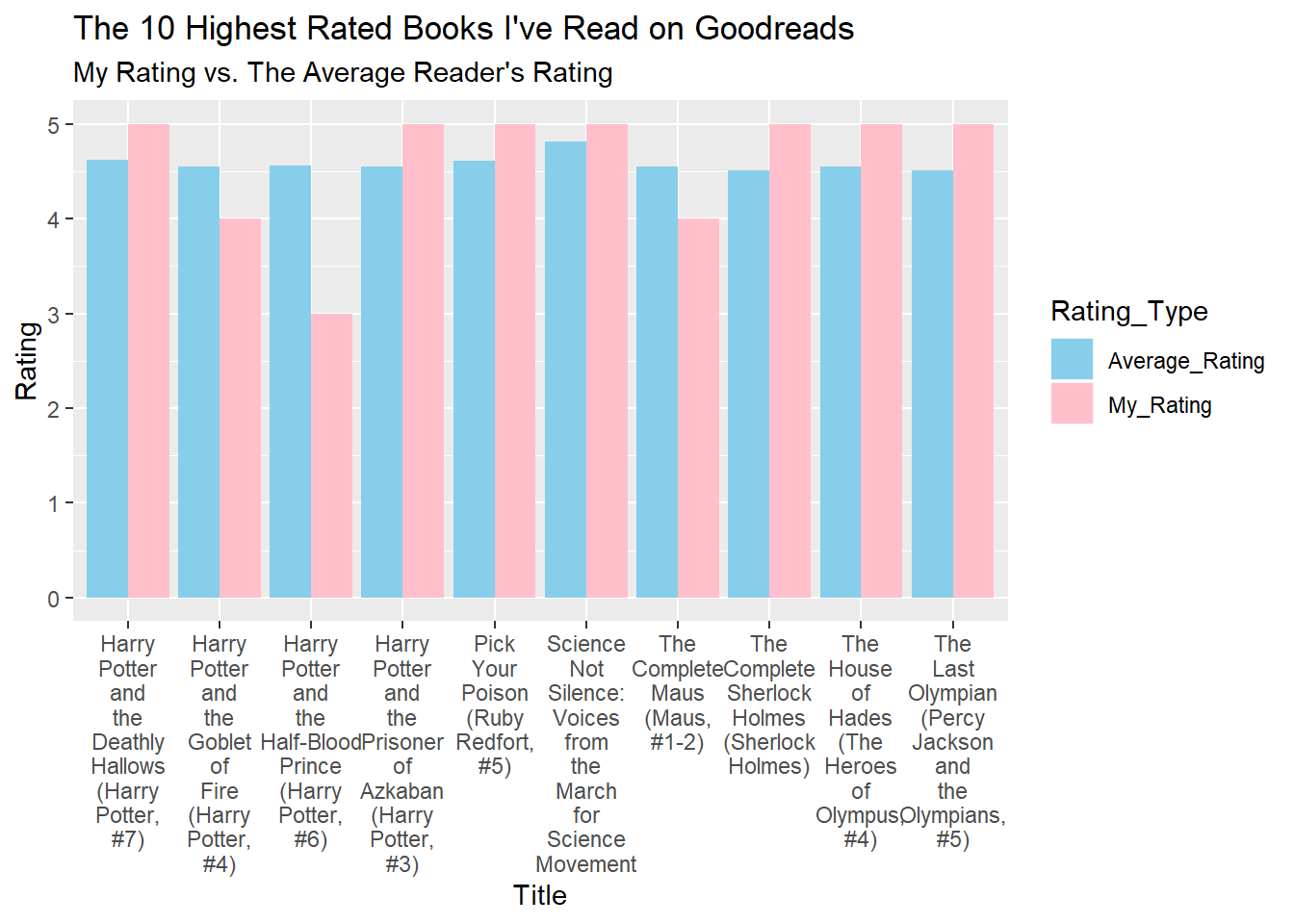
After that, I wanted to see what the 10 worst-rated books were that I had read, and what I had thought of them. This graph shows a comparison of the average rating (blue, following the color scheme above) versus my own rating (pink). This graph was challenging to make because I had to use the dplyr verb gather(), which I find very confusing, but some Googling/Stack Overflow helped me out.
worst_books <- gr_tbl %>%
  arrange(gr_tbl$Average_Rating)%>%
  subset(Average_Rating<3.44)%>%
  select(Title, My_Rating, Average_Rating) %>%
  gather(Rating_Type, Rating, Average_Rating:My_Rating)

ggplot(worst_books, aes(Title, Rating, fill=Rating_Type)) +
  geom_col(position="dodge") +
  scale_x_discrete(labels=wrap_format(5)) +
  labs(title="The 10 Lowest Rated Books I've Read on Goodreads", subtitle ="My Rating vs. the Average Reader's Rating") +
  scale_fill_manual(values=c("skyblue","pink"))

best_books <- gr_tbl %>%
  arrange(desc(gr_tbl$Average_Rating)) %>%
  subset(Average_Rating>4.50) %>%
  select(Title, My_Rating, Average_Rating) %>%
  gather(Rating_Type, Rating, Average_Rating:My_Rating)

ggplot(best_books, aes(Title, Rating, fill=Rating_Type)) +
  geom_col(position="dodge") +
  scale_x_discrete(labels=wrap_format(5)) +
  labs(title="The 10 Highest Rated Books I've Read on Goodreads", subtitle="My Rating vs. The Average Reader's Rating") +
  scale_fill_manual(values=c("skyblue","pink"))
Sources of Error & Takeaways
As usual, several assumptions and errors are present in this data. First, it’s not always the best to use the arithmetic mean, but until I take higher level probability and statistics, which looks like it’ll happen this upcoming Fall semester, I’m using the arithmetic means for now.
The other issue is that Goodreads only allows you to rate a book from 1-5, no half-stars and no non-integer values.
There’s also bias in my data because this is my Goodreads data, and I like to give high ratings to books. I read a lot of chick lit, teen romance, and murder mysteries, but I have broadly popular tastes. That being said, this was a fun data set to poke around with; I practiced a bit more of my dplyr verbs, and I’m wondering what other websites I could download my data from to fool around with!