At long last, I’ve gotten around to playing with the data I’ve collected all semester tracking my commute, which I promised to do pretty much the second I started this blog (see my first post). I have a pretty complex commute - I take the MBTA’s green line into Park Street and then connect to the red line, so I usually leave the house 1 hour and 15 minutes before class starts.
To collect this data set, during my commute, I wrote down whether I was leaving the house to get to my 8 a.m. class (leaving the house at ~7 a.m., early) or my 9 a.m. class (leaving the house at ~8 a.m., late), and recorded the time at various stops on my commute.
head(commute)
## # A tibble: 6 x 11
##   date  commute_type time_left_house time_boarded_tr~ type_of_train
##   <chr> <chr>        <drtn>          <chr>            <chr>
## 1 2/11~ late         07:40           7:45:00 AM       D
## 2 2/12~ early        06:45           6:52:00 AM       39 - 7:08 @ ~
## 3 2/13~ late         07:40           7:49:00 AM       D
## 4 2/14~ early        06:42           6:53:00 AM       D
## 5 2/15~ late         07:44           7:48:00 AM       D
## 6 2/19~ early        06:42           6:47:00 AM       D
## # ... with 6 more variables: time_at_park <chr>, time_red_line <chr>,
## #   time_jfk_umb <chr>, delayed_mbta <chr>, delayed_line <chr>, late <chr>
Using the Lubridate Package
Below is a long string of cleaning I did to my data. I mutated all of my times using mutate() from the dplyr package, and used the as.hms() function in the lubridate package to turn my times into a format that would be readable for R (as many of you know, Excel sucks when it comes to dealing with dates/times. I also subsetted the data frame to include only my early or late commutes (sometimes I had to leave for a class at weird times if it was cancelled or meeting irregularly).
commute2 <- mutate(commute, time_left_house=hms::as.hms(commute$time_left_house)) %>%
  mutate(time_boarded_train=hms::as.hms(commute$time_boarded_train)) %>%
  mutate(time_at_park=hms::as.hms(commute$time_at_park)) %>%
  mutate(time_red_line=hms::as.hms(commute$time_red_line)) %>%
  mutate(time_jfk_umb=hms::as.hms(commute$time_jfk_umb)) %>%
  mutate(commute_length = as.duration(time_left_house-time_jfk_umb)) %>%
  mutate(commute_length = as.numeric(commute_length)) %>%
  mutate(commute_length = commute_length/60) %>%
  subset(commute_type != "neither") %>%
  subset(type_of_train == "D")

#separate into late and early commutes
commute_early <- commute2 %>%
  subset(commute_type=="early")

commute_late <- commute2 %>%
  subset(commute_type=="late")
Limitations to this data set include the fact that sometimes I accidentally forgot to record the times of some things, leading to some “N/A” values. Other errors included the fact that there are many ways to get to my classes, but I only chose to examine the times I took the D line, which is by far the easiest commute for me, and thus the most common in the data set.
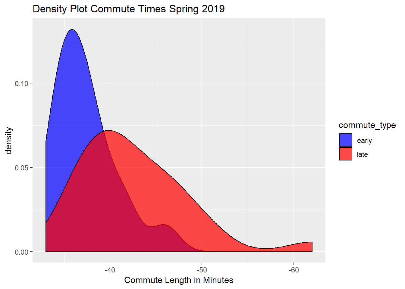
The Density Plot
This density plot below shows the commute length in minutes and its frequency. We can see that my late commute tended to be longer, which is what I expected due to rush hour traffic. We can also see that there were a few instances where the MBTA was super delayed, leading to a really long commute (over one hour).
ggplot(commute2, aes(commute_length, fill=commute_type)) +
  geom_density(alpha=.7) +
  labs(x="Commute Length in Minutes", title = "Density Plot Commute Times Spring 2019") +
  scale_x_reverse() +
  scale_fill_manual(values=c("blue","red"))
## Warning: Removed 2 rows containing non-finite values (stat_density).
T - Test?
In an ideal world, I would’ve liked to use a two-sample T-test to see if there was a difference between leaving early and leaving later due to rush hour, and how big that difference was. However, the Shapiro-Wilk test showed that my data was not normally distributed, so a two-sample T-test wouldn’t have any meaning. You can also see the lack of normality in the density plot.
shapiro.test(commute_late$commute_length)
##
## 	Shapiro-Wilk normality test
##
## data:  commute_late$commute_length
## W = 0.8914, p-value = 0.01011
shapiro.test(commute_early$commute_length)
##
## 	Shapiro-Wilk normality test
##
## data:  commute_early$commute_length
## W = 0.90847, p-value = 0.09425
Final Results (displayed on this really cool map!)
I used lubridate to calculate mean durations in minutes and seconds of each segment of my commute, faceted by whether the commute was early or late. Here’s the result, superimposed on my actual commute.
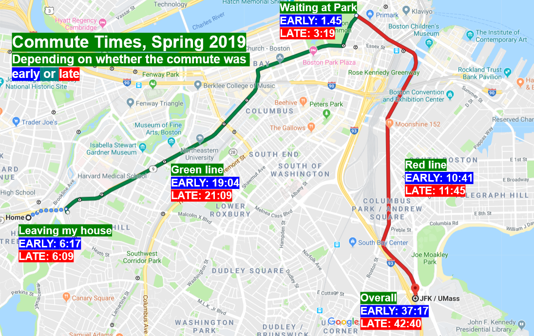
Some things surprised me, although there are some issues with extrapolating from the arithmetic mean. No surprise, but the early commute was shorter than the later one occuring at rush hour by about five minutes, and it seemed that almost every segment of the later commute was slightly longer than the early commute, except for waiting for the green line. This was not surprising - I suspected the MBTA would be generally uniformly slowed down as rush hour picks up.
Future Directions
Since I know my class schedule for next semester, I’m going to continue tracking my commute to school to see if the train gets worse in the winter as compared to the spring. Many Bostonians hypothesize this is the case, and I’d love to test that (at least from one commuter’s perspective). I also plan on including more variables, because even though my commute on the MBTA technically ends once I get to the JFK UMass stop, I still have to get to campus, which is a mile away from the MBTA stop and sometimes I take the shuttle. There are definitely more things I’d like to explore with this data set, and I hope to revisit it in September!