The Setup
In this blog post, I am going to complain about how difficult it was to recreate this graph that we were supposed to make for Ecology Lab.
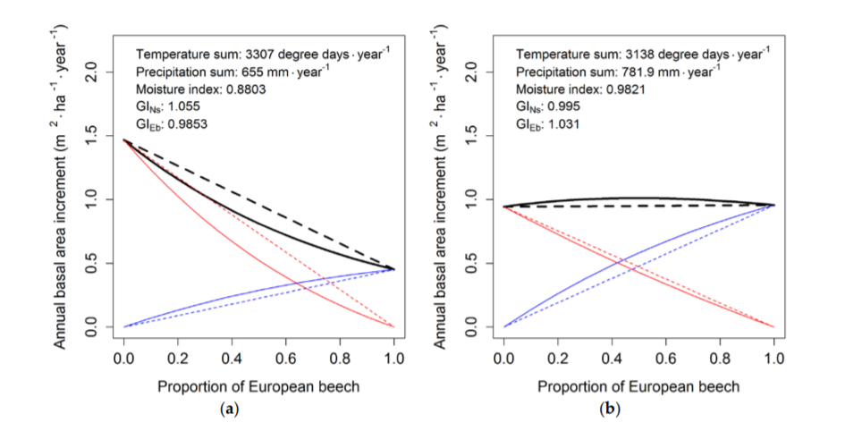
Figure 1: (Houper et. al 2018)
The point of this graph is to show the effect of interspecific competiton on plant biomass (size). The best way interspecific competition can be summed up simply is to say that plants that grow alone (not competing with another species) have more biomass than plants that grow with another species (because they have to compete). This makes sense because a plant that has to compete has to use energy to get limited resources in the environment, so it has less energy to spend on growing bigger.
Once we had collected the data in class, which we did by growing a bunch of plants, then we had to graph it similar to the one above.
#reading file in
interspecific <- read_csv("C:/Users/chfal/Documents/GRAPH_MY_UNDERGRAD/BlogDown2/content/post/interspecific_competition.csv")
## Parsed with column specification:
## cols(
##   treatment_id = col_character(),
##   proportion_mustard = col_double(),
##   seed_density = col_character(),
##   mustard_grown = col_double(),
##   alfalfa_grown = col_double(),
##   biomass_alfalfa = col_double(),
##   biomass_mustard = col_double(),
##   total_biomass = col_double()
## )
The Problem with the Graph
I had several issues with this. First of all, the graph above is mostly confusing, so it’s hard to tell what is going on. Second of all, even though the graph does not have two y axes, it was a requirement for our project that our graph have two y axes to illustrate the biomass of one competitor versus the biomass of the second competitor.
And as we all know, it is difficult to do that in R because ggplot2 does not love graphs with two y axes.
I fixed that problem with the package called plotrix using the function twoord.plot(). twoord.plot() takes four arguments, one for each axes (lx, rx, ly, ry) where l refers to the left and r refers to the right axes.
library(plotrix)
The Next Problem with the Graph
After I had figured out how to use Plotrix, my next problem was that I had to draw in the straight lines. The straight lines are theoretical biomasses and did not directly come from the data, so that’s what the ablines() are doing. It was a challenge to guess and check the values of the ablines() because I was mainly looking to draw a straight line from each y-intercept to zero. I’m sure there’s a better way to do this, but it worked for now, even if it was a whack-job solution.
The last challenge I had with the graph was graphing the green line, which represents total biomass of all of the plants together. This was difficult because I had run out of arguments to put into twoord.plot()! I devised a solution where I just used points() to graph them manually. Again, I’m sure there’s a better way to solve this, but I was getting a little frustrated and ready to move on.
So, here are the graphs!
Two graphs are presented, representing the high density conditions of 400 mustard and alfalfa seeds, and low density conditions of 200 mustard and alfalfa seeds.
#filtering file with dplyr
interspecific_high <- interspecific %>%
  filter(seed_density == "High")

interspecific_low <- interspecific %>%
  filter(seed_density == "Low")
#working with low data
attach(interspecific_low)
twoord.plot(lx=proportion_mustard, rx=proportion_mustard, ly=biomass_alfalfa, ry=biomass_mustard, xlab = "Proportion of Mustard", ylab = "Biomass Alfalfa in Grams", rylab="Biomass Mustard in Grams",type="p", main="Interspecific Competition: Mustard & Alfalfa Low Seed Densities", lylim=range(0,20), rylim=range(0,20), lcol="blue")
abline(6.3,-6, col="blue")
abline(0,15,col="red")
abline(7,8,col="darkgreen", pch=0)
points(0, 6.3, col="darkgreen", pch=0)
points(1,15, col="darkgreen", pch=0)
points(.25,9, col="darkgreen", pch=0)
points(.5,8.2666, col="darkgreen", pch=0)
points(.75,10.133, col="darkgreen", pch=0)
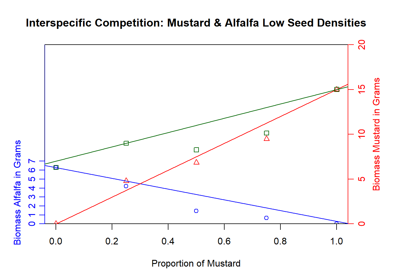
detach(interspecific_low)
#working with high data
attach(interspecific_high)
twoord.plot(lx=proportion_mustard, rx=proportion_mustard, ly=biomass_alfalfa, ry=biomass_mustard, xlab = "Proportion of Mustard", ylab = "Biomass Alfalfa in Grams", rylab="Biomass Mustard in Grams",type="p", main="Interspecific Competition: Mustard & Alfalfa High Seed Densities", rylim = range(0,30), lylim =range(0,30), lcol="blue")
abline(11,-11, col="blue")
abline(0,22, col="red")
abline(11,12, col="darkgreen")
points(1,21.8, col="darkgreen", pch=0)
points(.25,8.4333,col="darkgreen",pch=0)
points(.5,13,col="darkgreen",pch=0)
points(.75,13.6667,col="darkgreen",pch=0)
points(0,11,col="darkgreen",pch=0)

detach(interspecific_high)
The Results
The results of the graph do show that interspecific competition was in play, which was the question we were trying to answer. (Gosh, writing about the process of these graphs as well as the experiment is a nightmare!)
We can infer that interspecific competition is occurring because the experimental data (the green squares) is beneath the line of the ideal data of biomass (the green line.) All this is saying is that when grown together, alfalfa and mustard have a lesser total biomass than they would if they were grown alone under ideal conditions. That means that interspecific competition is affecting this experiment and that plants are using less of their energy to grow large, and more of their energy to take resources for themselves so the other species can’t take it.
Plotrix Is Pretty Cool!
My final thoughts on using Plotrix was that it was interesting to use base R’s plotting graphics rather than ggplot2. A lot of R users are huge fans of ggplot2 and I am among them, because I think the arguments are way cleaner and the whole thing works very cohesively. That being said, Plotrix is a good package and I’d totally use it again.
Mostly I posted on the blog to a) update the blog, b) complain about the fact that I even had to make a double-y-axes graph to begin with, and c) put more code on the internet, because I think that everyone deserves to see this awful, “throw-shit-at-the-wall-and-see-what-sticks” method I used to construct these bad boys.
But, I mean, the results do look pretty cool (and sort of like what was supposed to be made)!
Citation
Houpert, Lea, et al. “Mixing Effects in Norway Spruce—European Beech Stands Are Modulated by Site Quality, Stand Age and Moisture Availability.” Forests, vol. 9, no. 2, 9 Feb. 2018, p. 83., doi:10.3390/f9020083.