In-Depth Commute Analysis: Final Project
For my final project in my Computational Statistics (Math 448) class, I had to analyze a dataset. I decided to do an indepth analysis of my commute (finally). The results are below!
Introduction & Data
Ever since coming to campus in Fall 2017, I have become obsessed with timing my commute and seeing how long it takes to go to Brookline Village to UMass Boston. This data may have a limited scope of importance, because my own commute has little effect on others’ lives. However, it does provide a fascinating glimpse into the inner workings, such as they are, of the MBTA.
This is a more in-depth followup to a previous post on my statistics blog which can be found here. Previous analyses have shown that commuting at rush hour took about five minutes longer than not commuting at rush hour.
Data
The data that I’m using has been painstakingly(!) collected across six months of commuting to school in a convenience sampling method. The structure of the dataset is as follows:
- Walking to my house from the train.
- Waiting for the train (wait_green).
- Riding the green line from Brookline Village to Park Street (green_line).
- Waiting for the red line at Park Street (wait_red).
- Riding the red line from Park Street to JFK/UMass (red_line).
- Walking, biking, or taking the shuttle from JFK/UMass to campus (walk_or_bike).
The process to go home occurs in reverse.
The methodology of collecting the data was that every time I commuted to school or home on a weekday, I collected the time using a digital wristwatch. I always rounded the time to the nearest minute for simplicity’s sake. I commuted in the same fashion in every day, and made every attempt to minimize my commute time by running for the train at top speed. I collected all of this data to the best of my ability, although some random and systematic errors are present in the data.
Research Questions
- What is the average length of each section of the commute? This would involve calculating the sample mean and variance for each segment. I would also like to know whether these are normal or not, and present histograms and the results of Shapiro-Wilk tests for each segment.
- If not normal, what probability distributions can I use to model the length of my commute? Using the MLE and MoM, I hope to find a suitable probability distribution. I doubt it is normally distributed - they are probably right skewed because although there is theoretically a minimum time needed to commute to school, due to delays, the commute could be hours long. Therefore, these longer commute times will pull out the durations, making the distribution abnormal.
- Is the difference between the length of the commute depending on the directionality (i.e., school to home versus home to school)? During my exploratory data analysis, I noticed that box plots created of distances had very different spreads. I would hope to test this with an F-test for variances between two populations.
- What segments of the commute have the largest contribution to the overall length? This would deal with methods of correlation and linear modelling to see which parts of the commute have the largest impact to the total time.
- How long can I expect my commute to be? Using the data, I would like to create confidence intervals for the length.
Question 1: How long are my commute segments, and are they normally distributed?
| segment | mean_time | stdev_time | p_value |
|---|---|---|---|
| green_line | 22.58 | 3.46 | 1.45e-07 |
| mbta_total | 38.12 | 5.61 | .0006423 |
| red_line | 11.93 | 2.12 | 2.2e-12 |
| time_wo_walk | 53.24 | 7.10 | .0009328 |
| total_time | 53.93 | 6.91 | .039 |
| wait_green | 4.05 | 3.15 | 1.08e-10 |
| wait_red | 3.18 | 3.17 | 5.96e-12 |
| walk_or_bike | 11.31 | 3.29 | 9.93e-06 |

The overall length of my commute is 55.9 minutes (nearly 56 minutes), with a variance of 6.91 minutes. The longest segment of my commute is the green line, which comes in at an average of 22.3 minutes and a standard deviation of 4.08 minutes. The time it takes to travel on the red line is 11.6 minutes, with a standard deviation of 2.12 minutes. The waiting times for the red line and the green line are very similar: It takes 4.05 minutes to wait for the green line, with a standard deviation of 3.15 minutes, whereas it takes 3.18 minutes to wait for the red line, with a standard deviation of 3.17 minutes.
Shapiro-Wilk tests for normality run across each column showed that the data is not normally distributed, all with p-values less than .001. In fact, none of the segments of the dataset were normally distributed, which is surprising because looking at the histograms, some seem to appear bell-shaped. However, it makes sense that these segments are not normally distributed: There is always a minimum time that it could take the MBTA to go to different stops because time warps don’t exist yet. There is also theoretically no upper limit to how long it might take the MBTA to arrive at its destination due to delays from malfunctioning trains, track work, police activity, or misbehaving passengers. Therefore, unlike with the Central Limit Theorem, the more data collected, the more left-skewed the data will be due to outlying delays.
Question 2: What probability distributions can be used to model commute times?
If we can’t use normal distributions to model this data set, what can we use? For this section of the research project, I’m going to analyze a subset of the data displayed above. I want to model the time it takes on the green line, the time it takes on the red line, and the time it takes overall using maximum likelihood estimation to estimate parameters for different distributions.
To plot these graphs, I created frequency histograms of each variable. The optimal number of breaks in the histogram was used according to the Freedman-Diaconis rule. To calculate the parameters of the distributions, I used the ENVStats package which uses maximum likelihood estimation. Several curves corresponding to different probability distributions were plotted atop the histogram.
The Distribution for the Total Time

Three different distributions were chosen to plot: The gamma, normal, and weibull. Upon visual estimation, the best distribution looks like the gamma. The gamma distribution had a shape parameter of 68.2686038 and a scale parameter of .8192905.
More Modelling: Shifted Chi-Square and Shifted Gamma Distributions
Given that the gamma distribution looked the best in the above analyses, it is possible that a shifted gamma distribution or a shifted chi-square (subgroup of the gamma) distribution might be a better estimate for these results.
To solve this problem, I created a negative log-likelihood function for the data with the gamma distribution, adding in a constant (the third paramter). We can see that using this distribution, the (\alpha) parameter is 9.1229224, the (\beta) parameter is 2.281909, and the shifting constant (c) is 35.099416. In addition, the minimized value of the function is 291.4696.
## $par
## [1]  9.129224  2.281909 35.099416
##
## $value
## [1] 291.4696
##
## $counts
## function gradient
##      186       NA
##
## $convergence
## [1] 0
##
## $message
## NULL
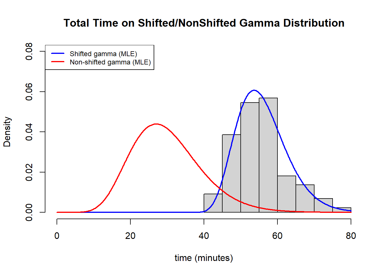
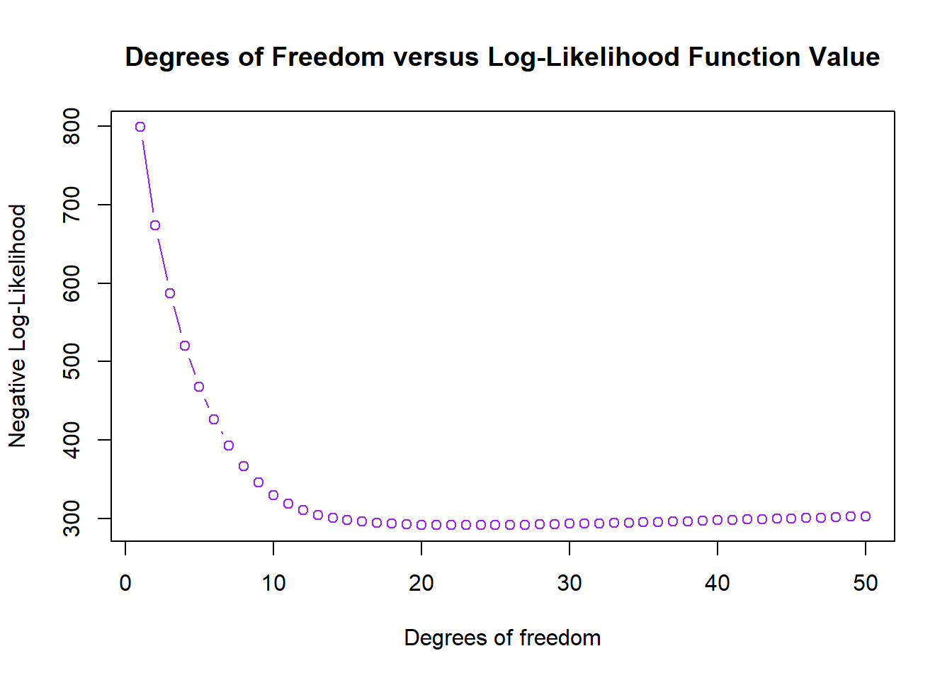
Next, a shifted chi-square negative log-likelihood model was created and minimized. The model is minimized with 23 degree of freedom and the shifting constant is 32.91041. In this model, the minimum value of the negative log likelihood function is 291.5154.
## [[1]]
## [[1]]$minimum
## [1] 32.91041
##
## [[1]]$objective
## [1] 291.5154
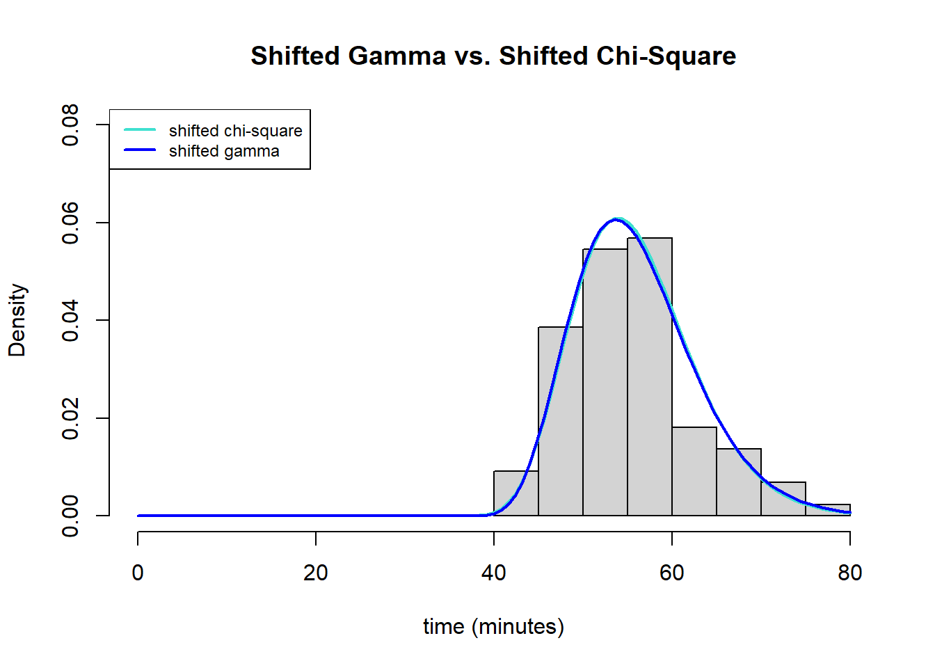
To test which model was better, I performed a likelihood-ratio test by dividing the moinimized value from the shifted gamma distribution (291.4696) versus the shifted chi-square distribution (291.5154). When doing a likelihood-ratio test, in this case, the test statistic has a chi-square distribution with 1 degree of freedom. This is because there are two free parameters in the gamma distribution and only one in the chi-square distribution, and 2-1 is 1 degree of freedom.
The result of the test wasa p-value of .75, meaning that it is not significant. Therefore, we fail to reject the null hypothesis that the more restricted model is better than the less restricted model. It seems that the chi-square distribution is better than the plain old gamma, even if only slightly. That being said, looking at the graph below there seem to be not that big of a visual difference.
# this is the likelihood ratio test statistic
(2*(291.5154-291.4696))
## [1] 0.0916
#this is the likelihood ratio test on the chi-square distribution with df=1
pchisq(.0916, df=1, lower.tail=FALSE)
## [1] 0.7621529
Question 3: Which part of my commute has more variance, going to school in the morning, or coming home at night?
To answer this question, I subsetted my data into two vectors: the total time it took to go home and the total time it took to come to school and compared them using an F-test for variances, which requires populations to be normal.
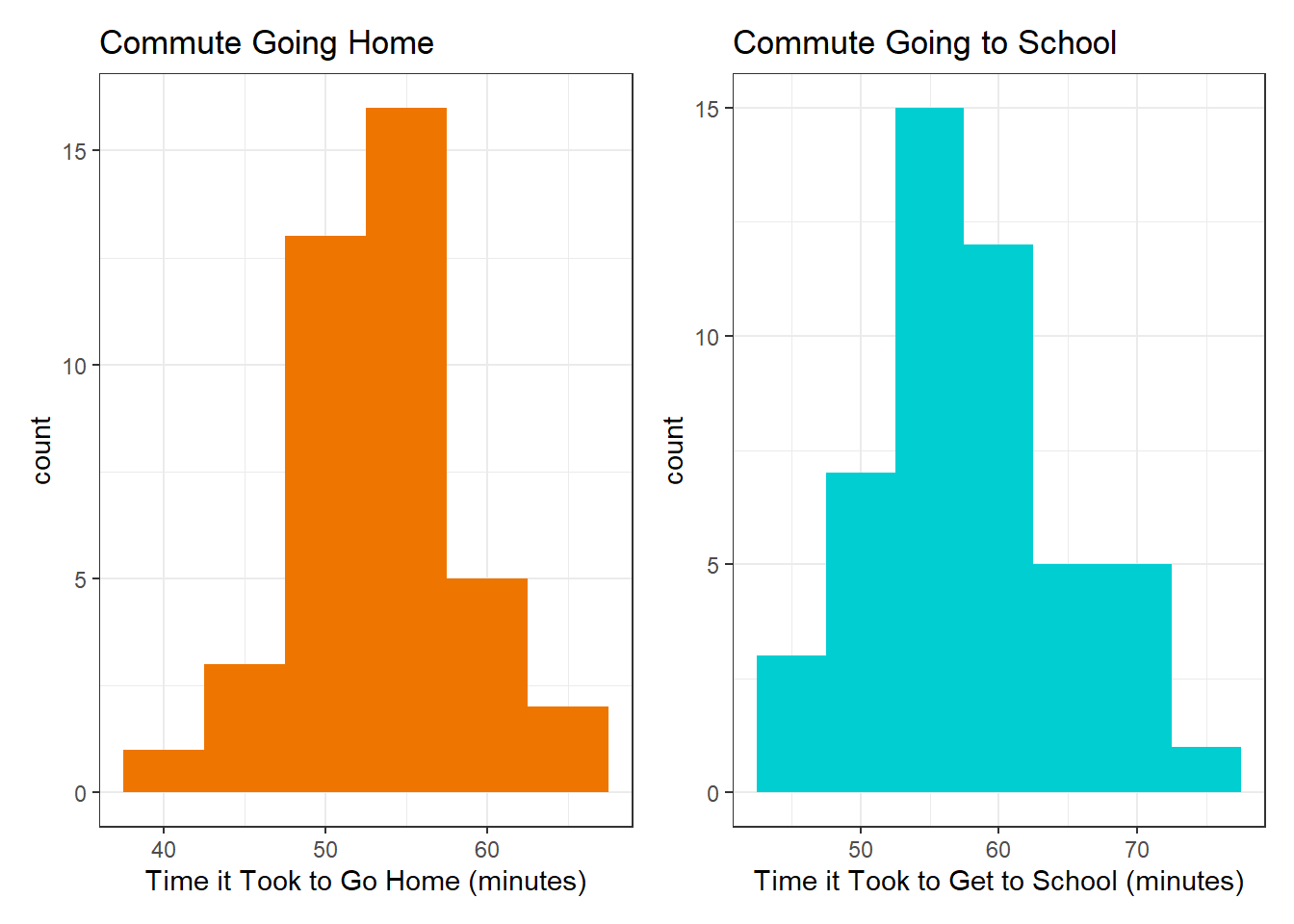 Given that the histograms appear normal and they pass the Shapiro-Wilk test, it is possible to then do an F-test for variances with the two vectors.
##
## 	F test to compare two variances
##
## data:  home_vector and school_vector
## F = 0.5366, num df = 39, denom df = 47, p-value = 0.04811
## alternative hypothesis: true ratio of variances is not equal to 1
## 95 percent confidence interval:
##  0.2945364 0.9947425
## sample estimates:
## ratio of variances
##          0.5365978
The result of the test shows a marginally significant difference between the variation of the time it takes to come home and the time it takes to go to school (p=.048). This is less than the widely accepted p-value of .05, but it is very close. Looking at the data, the variance of the time to come home is 29.0667 minutes^2 and the variance of the time to go to school is 54.1684 minutes^2. Therefore, the spread in the time it takes to go to school is slightly larger than the spread in the time it takes to come home, although the difference is marginally significant.
This result is actually justifiable based on my commute patterns. Previous data collection has shown that there is a significant difference between commuting at rush hour and commuting at non-rush hour times: Commutig at rush hour is longer and has a larger variance compared to commuting in non rush hour times. Much of the data I took coming home was not during rush hour because it was at 7 or 8 p.m. Contrarily, much of the data I took going to school was during rush hour because it was at 8 or 9 a.m. Therefore, the effect of rush hour may explain this result.
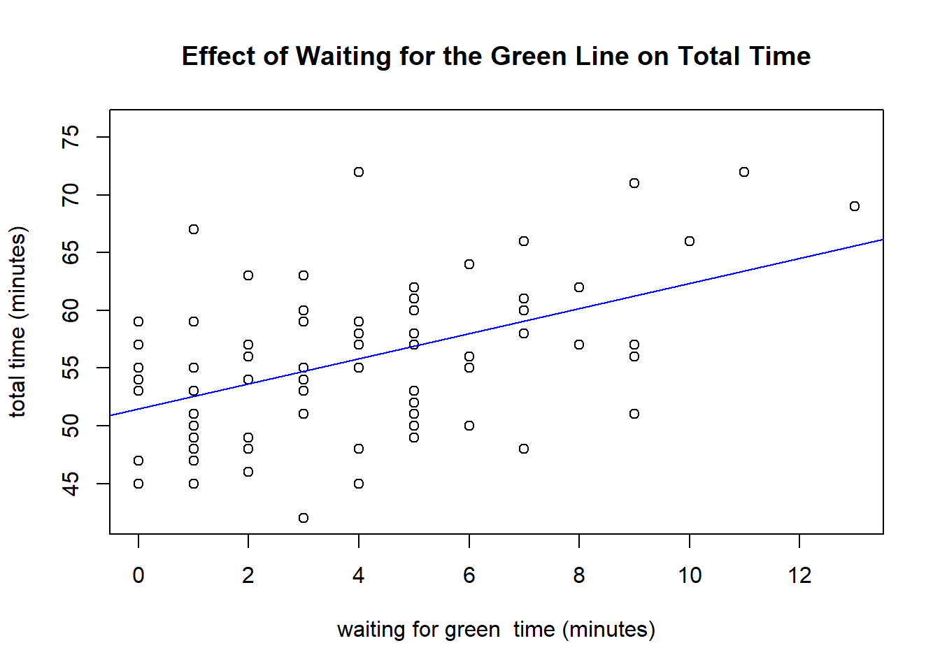
Question 4: Which segments of my commute contribute the most to its overall length?
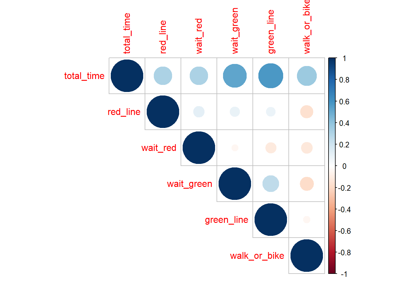 Looking at the correlation plot values for total_time, we can see that the two darkest blues (and therefore the most positively correlated) are how long it took to wait for the green line and how long that ride on the green line was.
This result makes sense, as the green line is the largest and therefore most significant part of my commute in terms of time taken up. It also has the standard deviation of all of the individual commute segments (i.e., commute segments that are not composites of the other segments.) Riders of the green line know how unreliable and spotty the service can be, especially in the part of the route that is above ground, and are often beleaguered by delays and the trains’ inability to pass each other if one is stuck - now we have statistical evidence pointing to unreliability!
The segments of the commute with negative correlations also have an easy real-life explanation: If the wait for the green and red line was longer, then the time to get from the station to the school (walk or bike) is shorter because it means the commute was delayed and I had to make up for it to not be late by taking the shuttle, which is faster, although a less eco-friendly option. Therefore, a change in behavior (driven by not wanting to be late to class) impacted this data. One of my original ideas was to compare two samples of being delayed versus not being delayed to class. This did not work though because I was not late enough times (n~30) during the period of the data collection.
Surprising results in this correlation matrix include the fact that there is a very slight negative correlation between the time waiting for the red line versus the time waiting for the green line. The fact that if I spend more time waiting for the green line, I spend less time waiting for the red line later does not make sense given my limted understanding of MBTA timetables. However, I created a linear model of the two variables and the subsequent 99% confidence interval of the true slope included 0, so there is likely absolutely no measurable correlation between those two factors and the result is only due to random sampling.
I used the correlation matrix to identify which variables are the most positively correlated with the overall length of the commute.
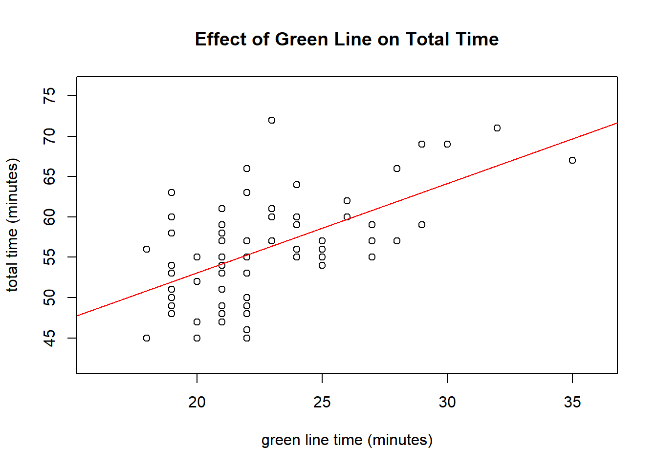
Linear Modelling for the Green Line Time
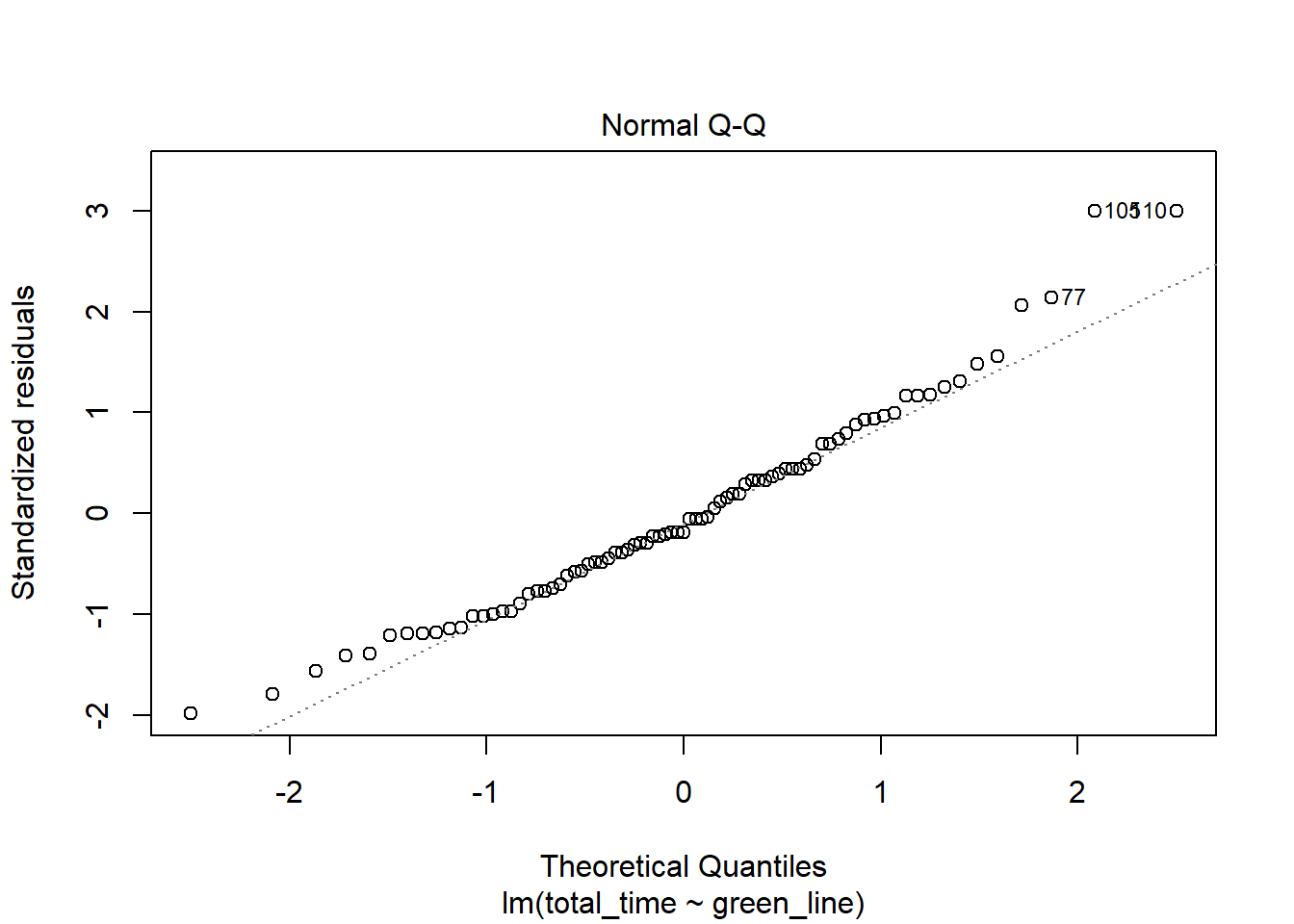
##
## Call:
## lm(formula = total_time ~ green_line, data = commute_2)
##
## Residuals:
##      Min       1Q   Median       3Q      Max
## -10.3022  -3.8334  -0.9835   2.8041  15.5916
##
## Coefficients:
##             Estimate Std. Error t value Pr(>|t|)
## (Intercept)  30.9650     3.9630   7.813 2.01e-11 ***
## green_line    1.1062     0.1731   6.389 1.07e-08 ***
## ---
## Signif. codes:  0 '***' 0.001 '**' 0.01 '*' 0.05 '.' 0.1 ' ' 1
##
## Residual standard error: 5.225 on 79 degrees of freedom
##   (77 observations deleted due to missingness)
## Multiple R-squared:  0.3407,	Adjusted R-squared:  0.3323
## F-statistic: 40.82 on 1 and 79 DF,  p-value: 1.071e-08
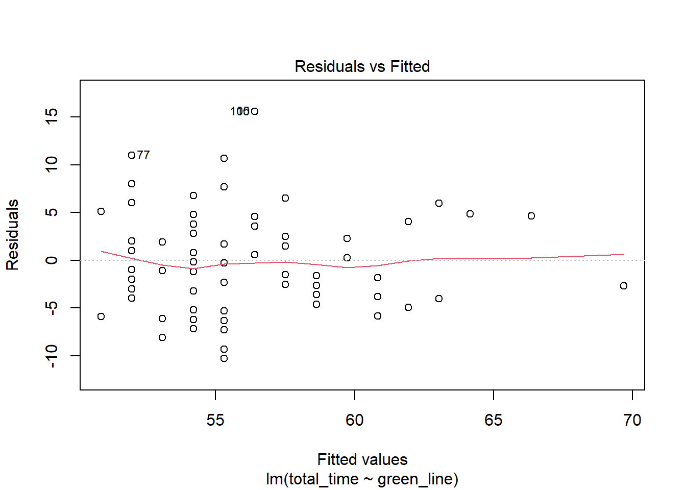
In this plot, we can see that the estimated relationship between the two variables is positive and fairly linear. The residual plot is mostly straight and the qq-plot has a straight middle, which is good. P-values for both the slope and the intercept are significant meaning that there is a statistically significant relationship between the two variables that isn’t just random or zero. The relationship between the two variables is as follows: (total)(time = 1.1062(greenline) + 30.965). This can be interpreted as that if there was no green line travel at all, we could expect the commute to be around 30 minutes. In addition, for every additional minute on the green line, we do not spend just one more minute commuting overall - we actually spend 1.106 minutes more. However, a 99% confidence interval produced did include 1, so this was likely due to randomness. Lastly, the (R^2) value of .3323 means that 33.23% of the variance in the data set is explained by the linear model. This is a fairly decent model which shows the effects of the green line on the overall time.
Linear Modelling for the Time Spent Waiting for the Green Line
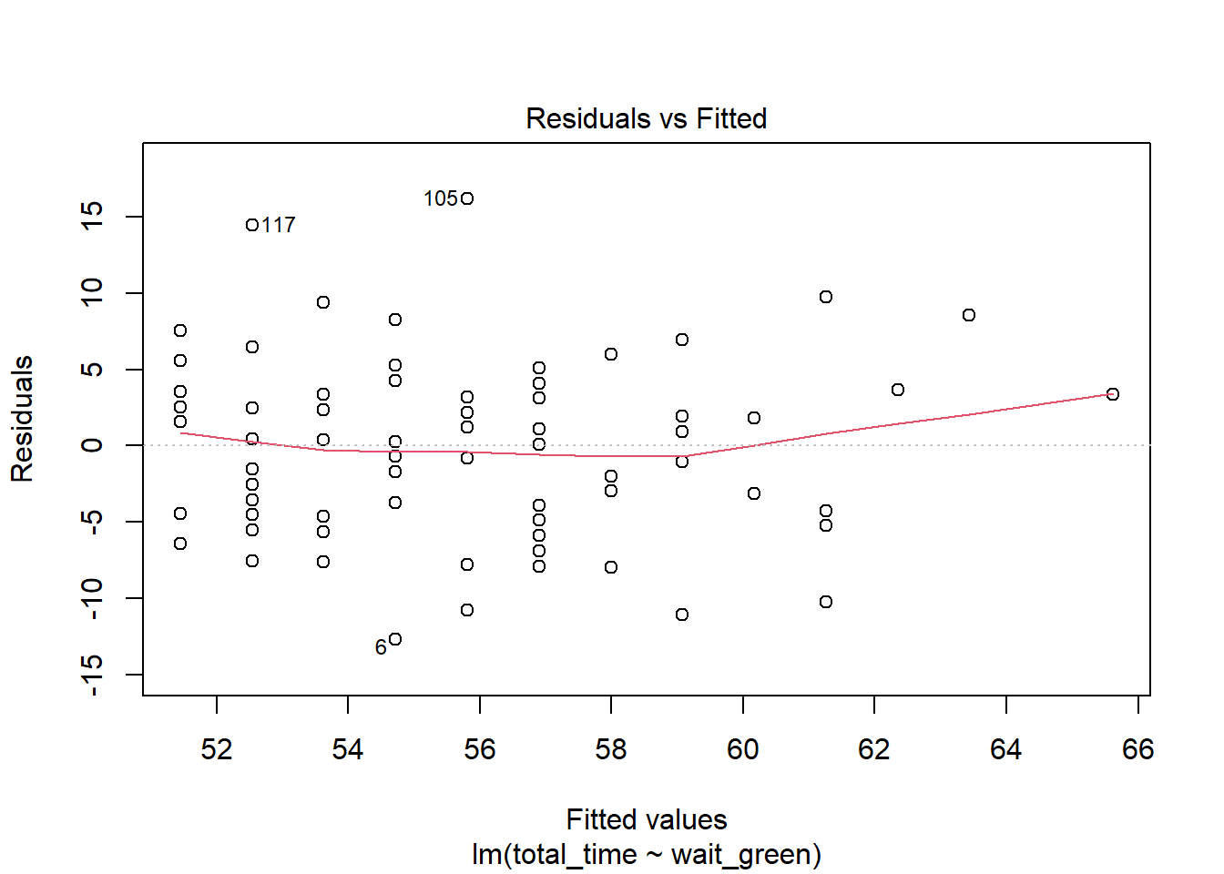
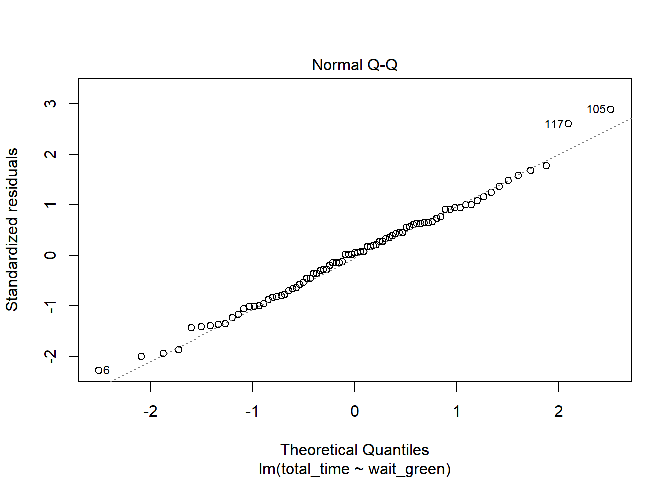
##
## Call:
## lm(formula = total_time ~ wait_green, data = commute_2)
##
## Residuals:
##      Min       1Q   Median       3Q      Max
## -12.7197  -4.0785   0.2803   3.4663  16.1906
##
## Coefficients:
##             Estimate Std. Error t value Pr(>|t|)
## (Intercept)  51.4505     1.0136  50.762  < 2e-16 ***
## wait_green    1.0897     0.2021   5.392 6.71e-07 ***
## ---
## Signif. codes:  0 '***' 0.001 '**' 0.01 '*' 0.05 '.' 0.1 ' ' 1
##
## Residual standard error: 5.629 on 81 degrees of freedom
##   (75 observations deleted due to missingness)
## Multiple R-squared:  0.2642,	Adjusted R-squared:  0.2551
## F-statistic: 29.08 on 1 and 81 DF,  p-value: 6.707e-07
Again, we can see that the relationship between the two variables is positive and fairly linear. The residual plot is mostly straight and the qq-plot has a straight middle, which is good. Again, P-values for both the slope and the intercept are significant meaning that there is a statistically significant relationship between the two variables that isn’t just random or zero.
The relationship between the two variables is as follows: (total)(time = 1.0897(waitgreen) + 51.4505). This can be interpreted as that if there was no waiting for the green line at all, we could expect the commute to be around 51 minutes and 30 seconds. In addition, for every additional minute waiting for the green line, we do not spend just one more minute commuting overall - we actually spend 1.0897 minutes more. However, this is not significantly different than 1, as the 99% confidence interval produced for the slope did include 1. Lastly, the (R^2) value of .2551 means that around 25% of the variance in the data set is explained by the linear model. Therefore, this model shows that the driving force behind the overall length of the commute may not be the time it takes to wait for the green line.
Question 5: How long will my commute be?
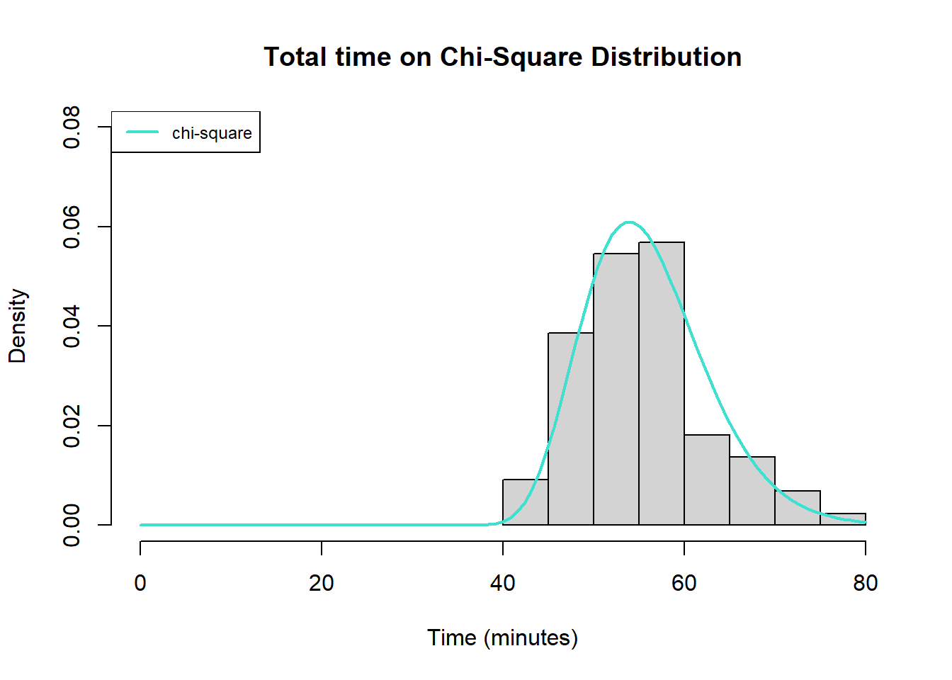
Given the fact that the chi-square distribution seemed the best, with the parameters 23 degrees of freedom and a shifting constant of 35.0992 minutes, the commute length can be described as below with a 95% confidence interval:
qchisq(c(.025,.975), df=23) + chat
## [1] 46.78797 73.17504
Therefore, we can expect that my commute is between 46.78 and 73.17 minutes long.
Conclusions & Limitations
In conclusion, my commute takes way too long. Important things we learned in the study include: That the average commute time takes about 55 minutes with a standard deviation of around 7 minutes; that a good distribution to model its length is the shifted chi-square distribution with 23 degrees of freedom and a shifted constant of 32.91041 - and that this model was slightly better than the gamma distribution with parameters (\alpha=9.12994, \beta=2.81909, c=35.099416); and that the subsections of the commute which most strongly correlate with its overall length is the green line (and waiting for the green line). Lastly we learned that the commute most often will be between ~46 minutes and ~73 minutes, again supporting my hypothesis that the MBTA is run by a bunch of malevolent entities.
This study, as with all studies, has its limitations. Firstly, the data was collected by me in a convenience sample so there was a lot of potential bias and systematic errors. In order to have a true representation of the mean time it takes to commute, these times should have been evenly distributed across the hours and days of the week. The data was collected only to the minute so the precision is low, especially because during rush hour, being a few seconds later can result in a person missing the first train and having to wait another fifteen minutes (not like I speak from experience). Therefore, further studies about my commute should involve stochasticity. Precision by using a smart watch with the seconds synced to a world clock could also be implemented in future studies. Lastly, another direction I would like to take this project in is comparing my own time to the estimated times given by the countdown clocks in the stations and apps such as Transit, which is the only app to be endorsed by the MBTA officially. But these analyses must wait until post-pandemic, because we all know it’s not safe to go on a train anymore, even just for fun.
Citations & Packages Used
Marie Laure Delignette-Muller, Christophe Dutang (2015). fitdistrplus: An R Package for Fitting Distributions. Journal of Statistical Software, 64(4), 1-34. URL http://www.jstatsoft.org/v64/i04/.
Owen, W. J., & Wackerly, D. D. (2008). Mathematical statistics with applications, seventh edition, Dennis Wackerly, William Mendenhall, Richard L. Scheaffer. Belmont, CA: Brooks/Cole Cengage Learning.
R Core Team (2020). R: A language and environment for statistical computing. R Foundation for Statistical Computing, Vienna, Austria. URL https://www.R-project.org/.
Taiyun Wei and Viliam Simko (2017). R package “corrplot”: Visualization of a Correlation Matrix (Version 0.84). Available from https://github.com/taiyun/corrplot
Thomas Lin Pedersen (2019). patchwork: The Composer of Plots. R package version 1.0.0. https://CRAN.R-project.org/package=patchwork
Wickham et al., (2019). Welcome to the tidyverse. Journal of Open Source Software, 4(43), 1686, https://doi.org/10.21105/joss.01686
Millard SP (2013). EnvStats: An R Package for Environmental Statistics. Springer, New
York. ISBN 978-1-4614-8455-4,
Yihui Xie (2020). knitr: A General-Purpose Package for Dynamic Report Generation in R. R package version 1.28.