Introduction
A lot has changed as a result of the Covid-19 pandemic, including the fact that we basically don’t leave our houses to see our friends, everything happens on Zoom, and we’re moving around a lot less (my summer internship has me examining large-scale mobility data changes, more on that later).
However, one of my pre-pandemic goals was to get better at working out every day and keeping in shape. In this post, I’m going to take a look at the Google fit data (collected from my smartphone, auto-tracking steps, moving/active minutes) before and after the pandemic to see what it looks like.
Getting the Data
First, I had to download my Google Fit data. I got that by going to my Google account and opening up Google Takeout, which is the company’s system for managing its users’ requests for data. It takes a while for Google to compress its huge amounts of data on you into one gigantic .zip file (about 10 minutes), but once it’s ready, they send you a link to your email.
Once I downloaded the .zip file, I extracted everything. There is a lot of files I didn’t end up using simply because they basically make one spreadsheet per day of your daily activity, and I didn’t want to multimerge 612 .csv files even though it is theoretically possible. I just wanted the summaries, which is only one .csv file helpfully called “Daily Summaries.”
Here’s what the data looks like. It’s luckily already in Tidy format, which is super nice. We’ve got date, calories burned (an estimate given height/weight/age), distance, latitude/longitude, varying speeds and times of activities. However, the metrics I wanted to compare the most were the move minutes (how many minutes a day I was active), heart points (the website says that you can earn two points per minute for intense activity and one point per minute for moderately intense activity, although the delineation on that is unclear), step count, and heart minutes.
head(fit_data)
## # A tibble: 6 x 25
##   Date       `Calories (kcal~ `Distance (m)` `Low latitude (~ `Low longitude ~
##   <date>                <dbl>          <dbl>            <dbl>            <dbl>
## 1 2018-10-30             247.            NA              NA               NA
## 2 2018-10-31            1427.            NA              NA               NA
## 3 2018-11-01            1437.           159.             NA               NA
## 4 2018-11-02            2062.          6627.             42.3            -71.1
## 5 2018-11-03            1733.          2924.             42.4            -71.2
## 6 2018-11-04            1562.           680.             42.3            -71.1
## # ... with 20 more variables: `High latitude (deg)` <dbl>, `High longitude
## #   (deg)` <dbl>, `Average speed (m/s)` <dbl>, `Max speed (m/s)` <dbl>, `Min
## #   speed (m/s)` <dbl>, `Step count` <dbl>, `Average weight (kg)` <dbl>, `Max
## #   weight (kg)` <dbl>, `Min weight (kg)` <dbl>, `Move Minutes count` <dbl>,
## #   `Heart Points` <dbl>, `Heart Minutes` <dbl>, `Biking duration (ms)` <dbl>,
## #   `Inactive duration (ms)` <dbl>, `Walking duration (ms)` <dbl>, `Running
## #   duration (ms)` <dbl>, `Dancing duration (ms)` <dbl>, `Treadmill running
## #   duration (ms)` <dbl>, `Swimming duration (ms)` <dbl>, `Yoga duration
## #   (ms)` <dbl>
Cleaning the Data
Since the data was pretty tidy already, that made my job a lot easier, especially because I didn’t want to have to multimerge all the .csv files. I decided I wanted to filter it into two ranges, so I used filter() to filter by date. I chose 2020-03-12, or March 12th, 2020, to be the date separating before and after the pandemic. I did that because that’s the day we all got sent home from school to start Zoom University.
Another problem with the data was anything that had a zero value was actually an NA so I needed to replace that.
before_covid <- fit_data %>%
  filter(Date >= "2020-01-01") %>%
  filter(Date <= "2020-03-11") %>%
  mutate_if(is.numeric, ~replace(., is.na(.), 0))
after_covid <- fit_data %>%
  filter(Date >= "2020-03-12") %>%
  mutate_if(is.numeric, ~replace(., is.na(.), 0))
Even just simple histograms show a huge difference in activity levels before and after Covid-19.
hist(before_covid$`Step count`, main = "Step Count Before Covid-19", xlab = "Steps")

hist(after_covid$`Step count`, main = "Step Count After Covid-19", xlab = "Steps")
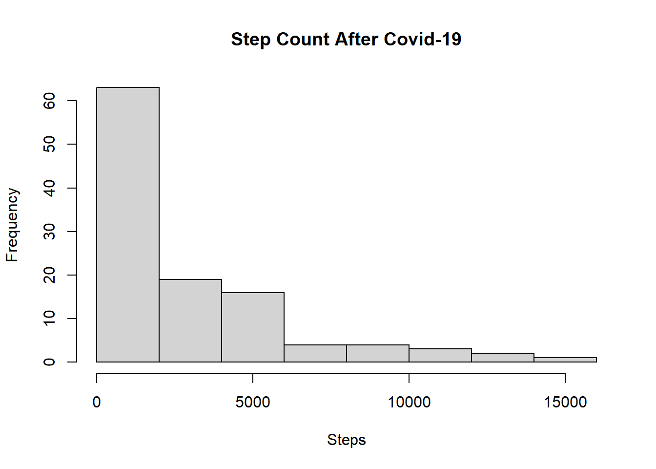
In the interest of time, and the fact that all of the other metrics pretty much seemed to disparagingly decrease after Covid-19 - including move minutes (the mean before covid was 96.76 minutes, and the mean after covid was 62.25 minutes), that made me feel pretty sad. Especially because during quarantine I had been trying to bike around and walk as much as possible, even though I’m obviously not moving around as much as I used to during the day - no jam-packed schedules of two jobs and 17 credits for me!
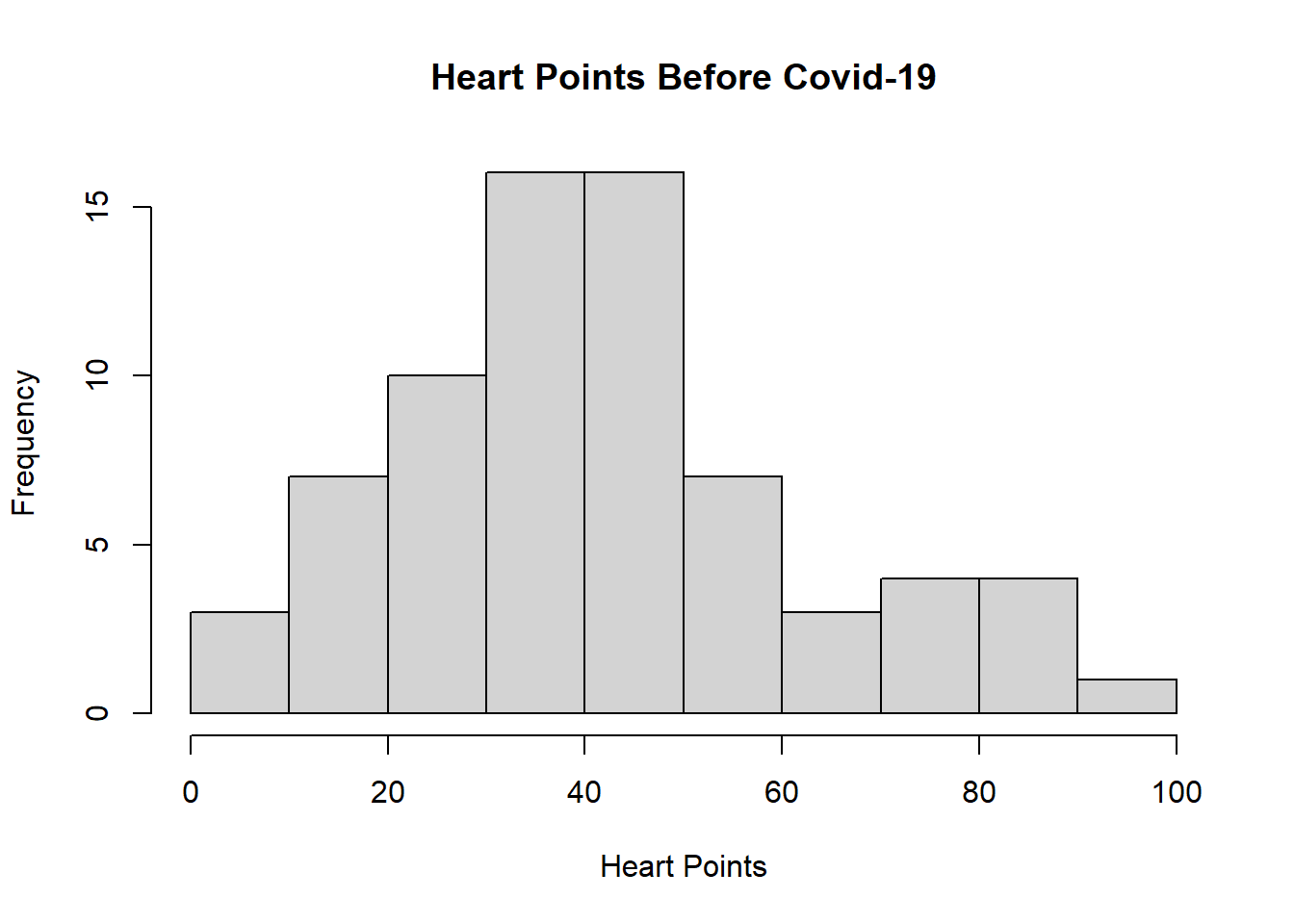
However, there was a glimmer of hope at the end of the tunnel. Both heart points and heart metrics seemed to go up because I try to do a bit of cardio every day (biking, walking) so it seems that although I am moving around less in general and less passively, I’m moving around more intentionally and at higher intensities than before.
hist(before_covid$`Heart Points`, main="Heart Points Before Covid-19", xlab="Heart Points")
hist(after_covid$`Heart Points`, main="Heart Points After Covid-19", xlab="Heart Points")
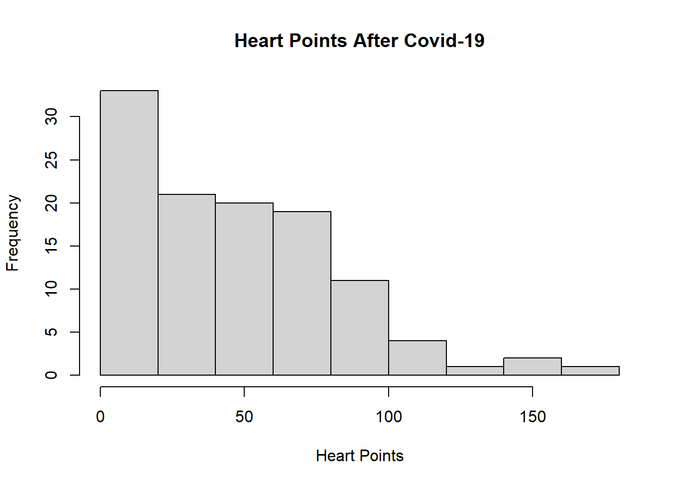
However, maybe I really do need to check my optimism because it’s likely these means are not statistically different. Since only one of the data sets is normally distributed (before Covid-19 is the normal one, because apparently nothing after Covid-19 can be normal), I couldn’t really run a z or t-test for means unfortunately.
#Takeaways
Nearly all metrics of movement data, including move minutes and step count, were decreased as a result of the physical distancing that occurred during the pandemic. However, the “heart points” and “heart minutes” seemed to increase, although that is likely not statistically significant. The differences definitely seemed to be driven by outlier days in the after Covid-19 dataset in which a large amount of exercise was done in a single day (I once biked twenty miles in a day just to see if i could do it.)
I think this goes as a lesson for all of us trying to be healthy during the pandemic: It’s really hard to keep up with the amount of passive exercise I was doing in my regular life, just walking to/from the T and screwing around downtown going shopping and to restaurants. However, since that’s on hold due to everyone’s safety, it’s still important to exercise in a healthy way outside. Going forward, I’ve even purchased a FitBit Charge 3 to keep more accountable (and also because I wanted to make more graphs - Fitbit even makes graphs of your sleep, which really delights the little inner nerd in me to wake up to a GRAPH of how I SLEPT. It’s the neatest thing since sliced bread!)
Anyways, keep staying safe and healthy all, and stay tuned for more posts about my own mobility and FitBit data, as well as my internship topic which is about Covid-19 mobility on a larger scale.